
Designing Digital Experiences That Actually Work
Good digital design is not simply about making something look impressive. It is about creating an experience that makes sense, feels natural, and helps people accomplish something.
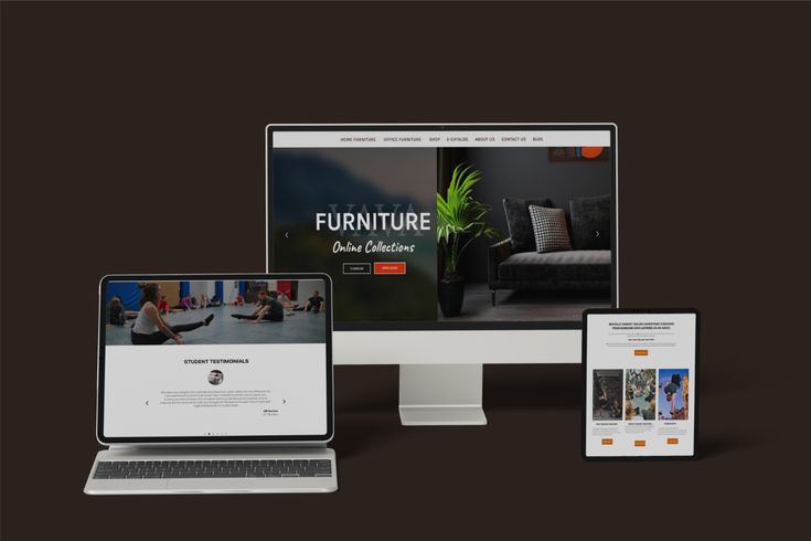
There is a tendency to judge digital design by how it looks first. A polished interface, beautiful typography, strong imagery, and carefully selected colours can immediately make a product feel impressive. But visual quality is only one part of the experience. A digital product can look excellent and still be difficult to use, confusing to navigate, or ineffective at helping someone accomplish their goal.
Start with the problem, not the interface.
One of the easiest mistakes in digital design is starting with screens before understanding the problem those screens are supposed to solve.
Before thinking about cards, buttons, navigation, animations, or colours, it is worth asking a much simpler question: what is the user actually trying to accomplish?
Once that becomes clear, design decisions become easier to evaluate. A feature is no longer valuable simply because it looks good. It becomes valuable because it helps move the user toward the outcome they need.
Clarity is a design decision.
Good interfaces communicate priorities. They tell users what matters, what they can do next, and where they are within the experience.
This is where hierarchy becomes important. Typography, spacing, scale, contrast, positioning, and repetition are not merely aesthetic choices. They are tools for directing attention.
When everything is given the same visual importance, nothing feels important. Strong design creates a clear relationship between primary actions, supporting information, and everything else.
Good design reduces unnecessary decisions.
Every interface asks users to make decisions. Where should I click? What does this mean? Which option should I choose? Where do I go next?
The designer cannot remove every decision, but they can remove unnecessary ones.
Clear labels, predictable navigation, sensible grouping, useful defaults, and consistent interaction patterns all reduce the amount of mental effort required to use a product.
The interface is part of a larger system.
A website or application is rarely experienced as a collection of isolated screens. Users experience it as one continuous system.
That means a button style, spacing rule, typography choice, navigation pattern, or interaction behaviour should make sense beyond one individual page.
Designing systems rather than isolated screens makes products easier to understand, easier to maintain, and easier to extend as they grow.
Design should survive implementation.
A design is not finished simply because the mockup looks good.
Real products have responsive layouts, different screen sizes, real content, loading states, empty states, errors, accessibility requirements, and technical constraints.
The strongest design direction is therefore one that can survive contact with development without losing the original intention.
The goal of digital design is not to make interfaces that people admire for a few seconds. It is to create experiences that people can understand, navigate, and use with confidence.
Keep reading.
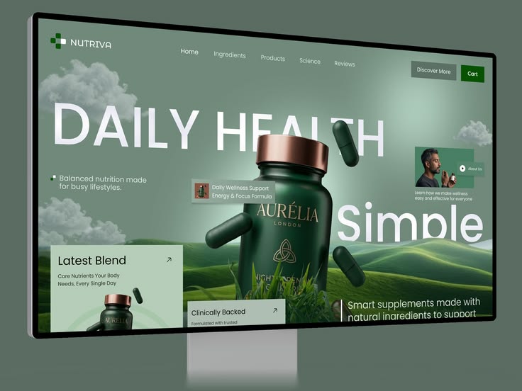
Why Great Websites Need More Than Good Design
A beautiful website can still fail if the structure, messaging, performance, and user journey are not working together.
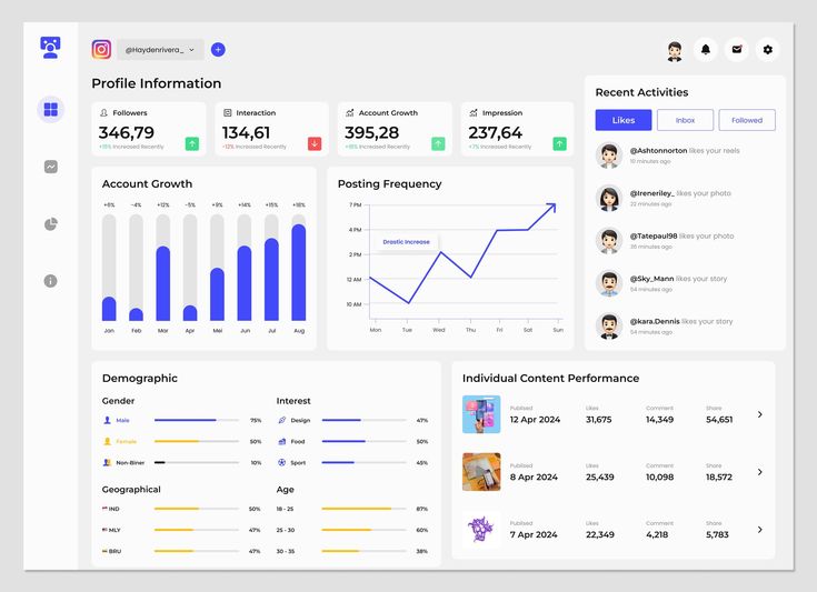
Building Products From the User's Perspective
The best interfaces begin before the first component is designed. They begin with understanding what the user is actually trying to accomplish.