Vikalpa
A digital experience balancing content, usability, and a clear visual communication system.
The project.
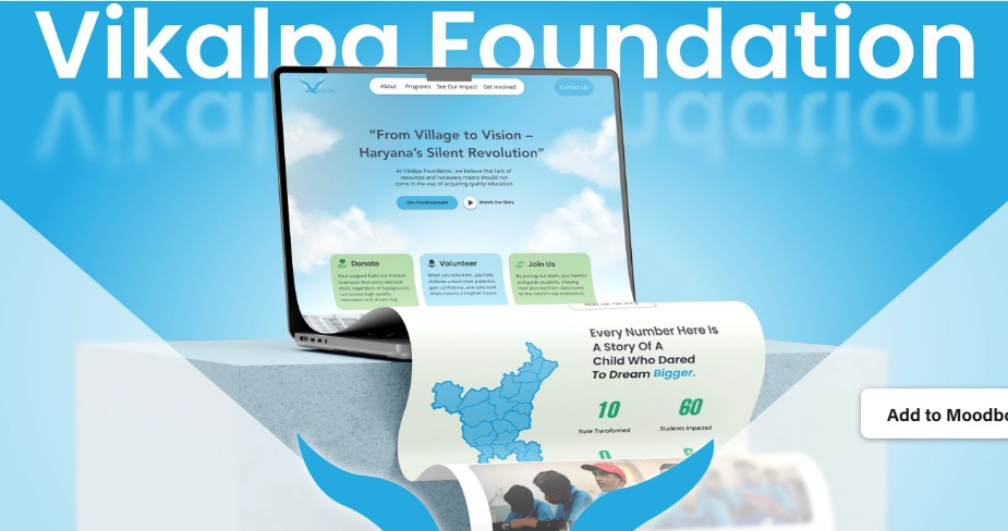
A digital experience designed around clear communication, accessible information, and a structured content hierarchy.
What needed solving.
The experience needed to communicate information without overwhelming users with competing content.
Understanding the problem.
The project direction considered content hierarchy, navigation patterns, readability, and the relationship between informational content and user actions.
The thinking behind it.
The experience was structured around clarity first, using hierarchy and consistent visual patterns to guide users through the available information.
From direction to execution.
The interface direction focused on establishing clear sections, visual hierarchy, consistent spacing, and responsive behaviour.
Bringing the idea together.
The digital experience was structured to support responsive layouts and straightforward navigation across device sizes.
What came together.
A focused digital experience that prioritizes clarity, accessibility, and a predictable user journey.
The work.