AO Skin
A refined visual identity direction for a modern skincare brand.
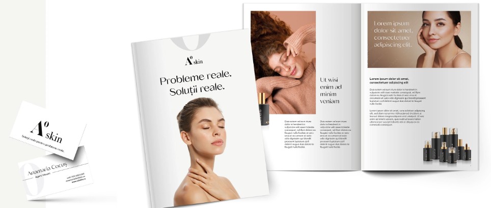
The project.
A contemporary skincare identity exploring premium communication, simplicity, and brand recognition.
What needed solving.
The visual direction needed to communicate a premium skincare position while remaining clean and approachable.
Understanding the problem.
The direction considered contemporary skincare branding, restrained layouts, typography, product presentation, and premium visual communication.
The thinking behind it.
The identity was approached through simplicity, controlled typography, clean composition, and a refined visual hierarchy.
From direction to execution.
Typography, layout, colour relationships, and visual composition were refined into a consistent direction suitable for digital brand communication.
Bringing the idea together.
The visual system was structured so that it could translate across digital pages, promotional material, and supporting brand graphics.
What came together.
A refined visual direction designed to give the skincare brand a more cohesive and premium presentation.
The work.
What the work achieved.
The resulting direction establishes a clearer visual foundation for communicating the brand across digital touchpoints.
What stayed with us.
Premium visual communication often comes from restraint and consistency rather than adding more visual elements.